Nestlé
Packaging Design
Client: Nestlé
Stouffer’s
Nestlé approached me with an exciting opportunity to assist them in visually refreshing their classic Stouffer's French Bread Pizza Portfolio, to celebrate 45 years of happy tummies.
The design objectives were improving shopability and creating new excitement through the design update, featuring bolder claims and an overt way to call out product benefits. To appeal to the targeted Gen Y/X/Z consumers, I would explore concepts inspired by retro packaging, taking cues from the 80s and 90s to differentiate it from its current 70s look. Along with iterations that aligned closely with the core aesthetic.
Spending time with the brand's guidelines and familiarizing myself with its core values, the update would have to be disruptive to provide on-shelf differentiation from its competitors while being rooted in the familiarity to reinforce brand loyalty.

The Process
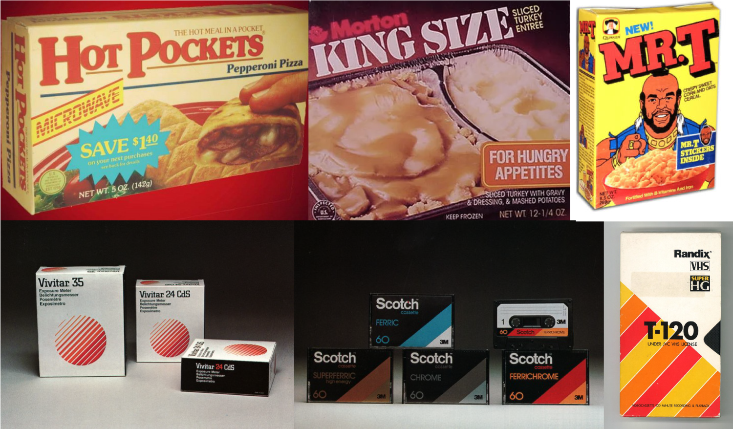
My process begins with visual research. I look back at the company's past designs to deepen my understanding of the brand's core aesthetic and design decisions. In addition to looking at Stouffer's old packaging, I dove deep into the 80s and 90s design, especially packaging design, taking notes on typography, composition, color choices, and motifs. All of my findings would be used as resource material when developing concepts.

Reference photos of past Stouffer’s product packaging.

1st round of iterations sent to Nestlé.

The 80s concept uses some of the time's most familiar motifs; the pronounced angles found throughout the composition, including photography, the line gradient used in the background, and bold staggered typography. Playful layering adds depth, creating the illusion of the pizza jumping out of the box, enticing the viewer to grab Stouffer's for dinner.

Inspiration images for the 80s concept.

Sticking to the same visual research process for the 90s concept, I felt inclined to look at what other successful brands were doing at the time. Being drawn to the minimal aesthetic of Nike and Apple ads of the 90s, I echoed the approach by stripping away most of the decorative elements to allow the photograph to have more prominence. Working through this iteration, I explored alternative photographic angles, considering the effectiveness of the top-down aerial approach typically seen in social media.

Inspiration images for the 90s concept.

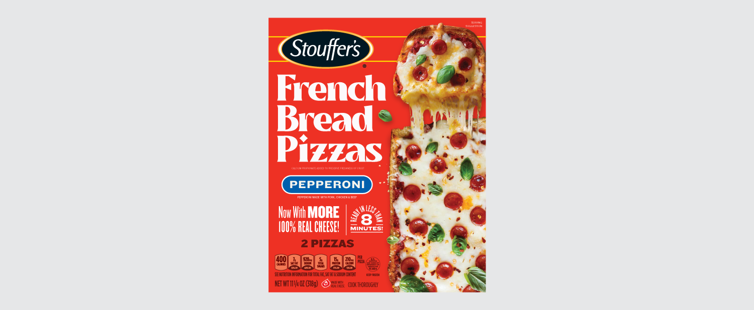
This take was an opportunity to reconfigure the composition to have it stand out from its competitors with the vertical format. Inspired by modern design trends and motifs, like the resurgence of brutalist design and typographic badges and lock-ups, I took a risk in being a bit more expressive with typography in this iteration.

Inspiration images for the Retro Modern concept.

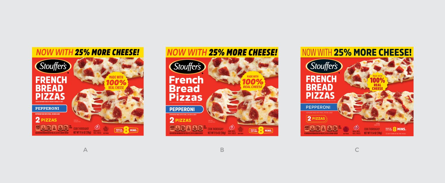
Final round of iterations based off the 90s concept.

After a few compositional tweaks and typography explorations based on feedback, the Nestlé team decided to proceed using the 90s concept with core fonts to reinforce brand fidelity. Spanning the top of the package, I created an impactful moment to draw attention to the product's new offer of more cheese, which is always a good thing. The photo comp I proposed was considered for final product shots, seen here in the final round of iterations. In the end, I created a retro-inspired design to breathe new life into the packaging that would appeal to a broad audience while strengthening the brand's core aesthetic.